[Case 03]
Reducing 75% Drop-off Rates through Self-Service Efficiency
Airline

Driving Inclusion Through AI Driven Future Protection
[Project Overview]
This case study details the process of revamping the help center and self-services section of the Singapore Airlines website. The primary objective was to ensure users could easily access the help they need and resolve issues independently, minimizing the need to call customer service.
[Goals]
[1] Meeting key business objectives
To ensure business KPIs of different departments are being met and call centre/customer service efficiency is increased - in terms of manpower and costs. To also increase brand loyalty.
[2] Defining design outcomes and expectations
To ensure a seamless and effective user experience when a user is to go to the Help Centre in order to look for a solution or any form of assistance. Increase customer satisfaction as well as enhance navigational ease and content relevancy.
[Industry]
Airline
[My Role]
Lead Designer
[Platforms]
Desktop
Mobile
[Timeline]
Jul 2023- Jun 2024
[Problems: Top-level findings]
The existing help center suffered from poor navigation, overwhelming textual content, and suboptimal information architecture, making it difficult for users to find information quickly and easily. This inefficiency led to high drop-off rates and increased customer service calls, impacting business efficiency and customer satisfaction.
Poor Navigation
Lack of a navigational system that funnels users to relevant pages or help channels, based on topics.
Poor information architecture & design
Poor information design and overwhelming textual content, creating heavy cognitive load that can hinder users from finding information quickly and easily.
[Uncovering the problems: defining existing issues]
Revamping information architecture through a centralised hub housing all help resources. Enhancing our content & information design to further improve findability. Opportunity to enhance our user experience, working towards a consistent, world-class brand.
UX Audit
Critiquing and identifying issues in the current help page and evaluating them against different parameters, standards and UX practices. Performing a heuristic evaluation to identify usability problems in order to prioritise the different types of existing issues.

Glassbox
Gathering data on rage clicks and struggle scores to evaluate user satisfaction when viewing the website.Measuring cognitive load and learnability of the page through recorded sessions.

Google Analytics
Gathering 1st and 2nd interaction data as well as drop-off rates to study how users browse the page to get help. Measuring task efficiency and if users are resorting to contacting customer support over self-servicing their issue. Figuring out where do people come from and go to next.

[Benchmarking and best practices]
Objectives: Inspirational findings from best practices benchmarking with 13 premium OAL competitors + non-airline industries.
Content
+
Usability
>
Features
Heuristics: Findability, usability, clarity of content, timeliness, usefulness.
Surface high-frequency topics for easy entry, benefiting both the user and business
Support quick scanning - Text hierarchy, Signposts, Numbers
Ensure section headers & page mastheads are specific & concise,
to create clarity in signposting
Be specific with your call to action
Use polyhierarchies to improve findability for
ambiguous IA Categories
Optimize for search with pre-emptive results.
Create high level overviews at the top. Use side navigations and content shortcuts, that information wayfinding.
Use icons and images to create visual signal
Emotional touch -
Help & support is a touchpoint that is significantly important for brand retention and loyalty.
Progressively disclose when appropriate.
Be mindful of breathing space and eye movement.
Feature benchmarking: Many of our competitors, on a high level - appear to not invest a lot of resources or effort into maintaining and enhancing their help experience.


[The Wireframing Phase]
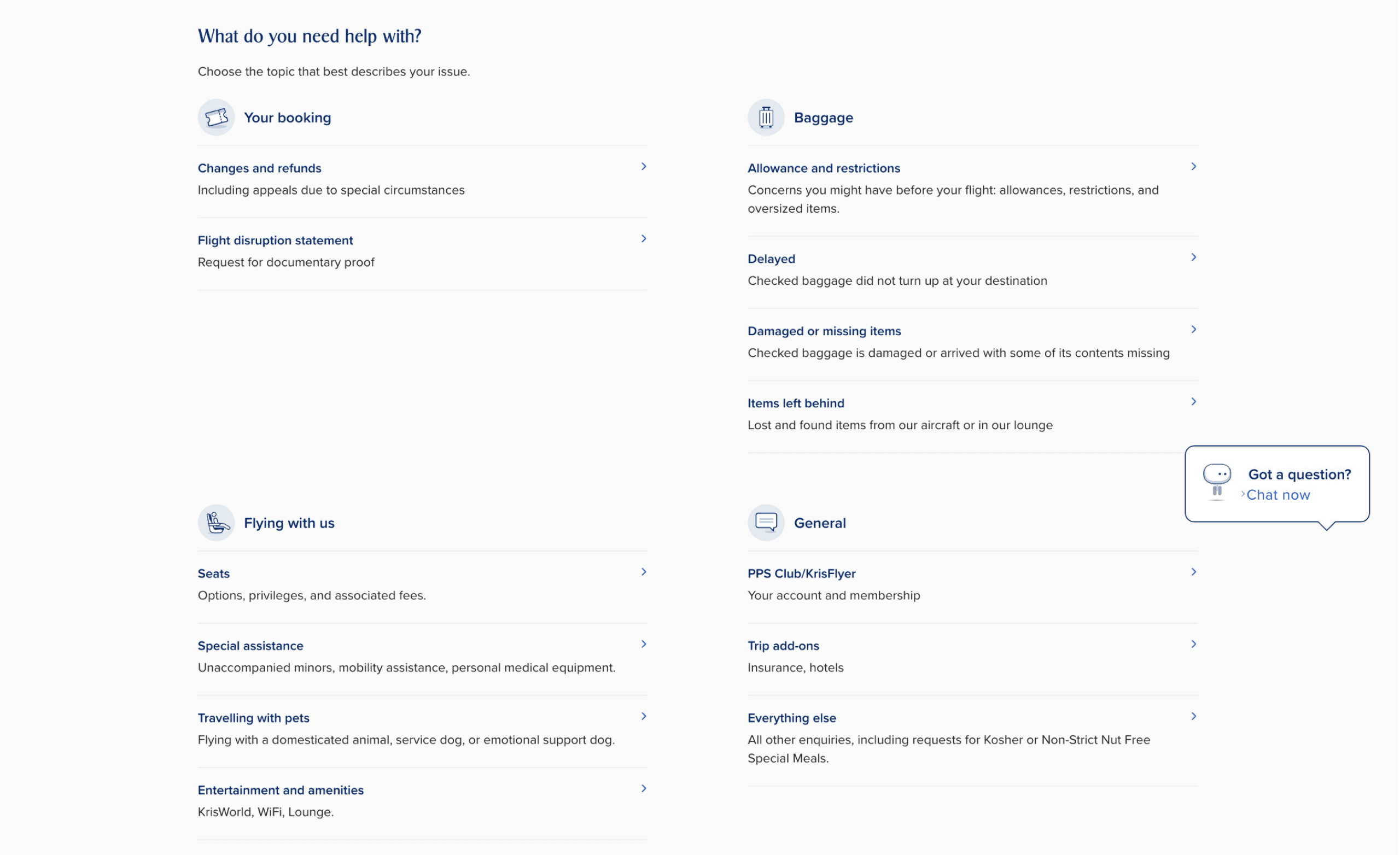
I started by wireframing the revamped help center. By floating ideas and exploring visions – I will be able to discuss feasibility when it comes to quick wins.

Old Page Design:

Revamp Design:
(Introducing new features - such as link to open up commonly asked questions on the chatbot immediately.)

[Measuring success through metrics]
The CASTLE framework was deployed and used together with the design and business goals to estabilish how the new designs will meet the goals and reduce the pain-points - which can be measured via Google Analytics, Glassbox and User Testing as well.
[Usability Testing]
Creating a plan is crucial to prepare prototypes for usability testing with real users and frame questions that are not leading, suggestive but rather contextual and open-ended in order to understand the user behaviour in the best way possible.
[Key Impact]
Reduced Drop-off Rates By 75%
The new design led to a significant reduction in user drop-off rates, indicating improved user engagement and satisfaction.
80% Increase in Self-Service Efficiency
Users could resolve issues more effectively without contacting customer support, reducing call center load and operational costs.
Enhanced Customer Satisfaction Positively by 110%
Positive user feedback highlighted the seamless and intuitive help center experience, contributing to increased brand loyalty.
[What My Colleagues Said]
Swapnil has been the best designer we have had to have worked on the Help / Self-services pillar - which is a challenging part of the website. His attention to detail and skill at conducting user research is very commendable, so a big thank you to him for his efforts!
His patience in understanding requirements is top-notch, and I really appreciate his creative approach to UX problems. He's is quick, efficient, takes the lead, and works hard!